
Make Sense of Your Audiogram
You’ve recently had a hearing test and were diagnosed with hearing loss. You may have been shown a graph with a lot of symbols and were told you need hearing aids. Even though the audiologist explained the graph and results, this can still be an overwhelming process, and it may be difficult to remember all you’ve learned once you leave the office.
What is an audiogram?
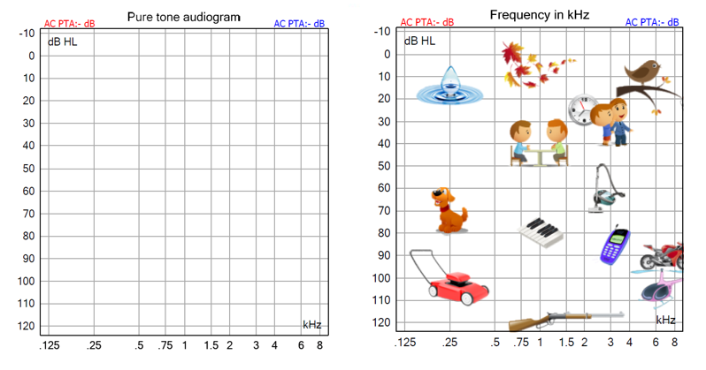
An audiogram is a graph that shows hearing thresholds, or the very softest that a person can hear at multiple different tones. The tones are measured as frequencies, in Hertz (Hz). On the graph below, you will see that the frequency falls on the x-axis, or horizontal line. Think of the horizontal line as a piano, where the notes range from very low pitches at the left, and rise to very high pitches to the right. Low pitched sounds, such as a large dog barking or a lawn mower, fall to the left side of the graph, whereas high pitched sounds such as birds chirping fall to the right side of the graph.
The volume of the tones is measured in decibels (dB), ranging from 0 to 120 dB. The volume falls on the y-axis, or the vertical line, and starts very quiet at the top, ranging to very loud at the bottom. For example, very soft sounds such as leaves rustling fall at the top of the graph, whereas very loud sounds such as a lawn mower, motorcycle or helicopter, fall towards the very bottom of the graph.
How is hearing measured?
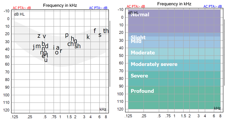
During a hearing test, a patient will raise their hand or push a button every time they hear a tone. The tones will get softer and softer until the patient stops responding. The very softest dB that the patient can hear, or responds to, is marked as their threshold for that frequency. The frequencies that are typically tested are within the normal speech range for humans: 250 – 8000 Hz, and hearing loss is measured in grades of severity. The further down on the graph that thresholds fall, the more severe a person’s hearing loss. Thresholds of 0 to 20 dB are considered to be within the normal range. Thresholds that fall outside of the normal range, from 25 to 120 dB, are considered a hearing loss and will be labelled as mild, moderate, moderately-severe, severe, or profound.
What does a hearing test result look like?
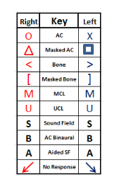
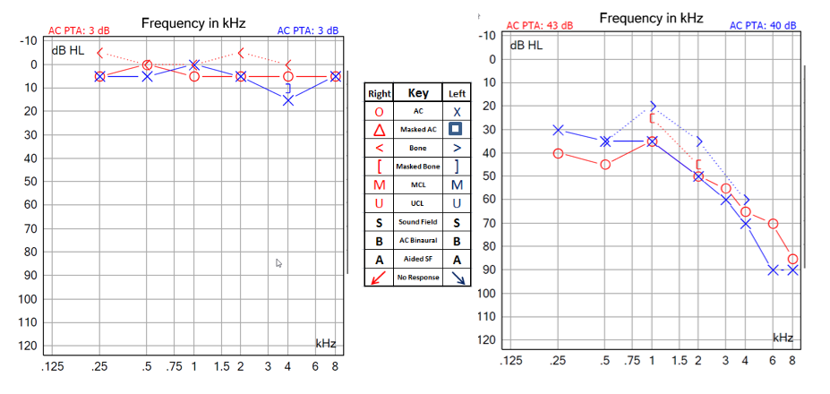
Thresholds are marked as a red circle for the right ear, and a blue X for the left ear. The higher up on the graph the marks are, the softer the patient can hear, or the better their hearing is. An example of normal hearing test result is shown in the below graph on the left. The lower down on the graph the marks are, the louder the tone needed to be in order for the patient to hear it. An example of a mild sloping to severe hearing loss is shown in the graph below on the right. This means that any sounds that are higher up on the graph than the marked thresholds cannot be heard unless the volume is turned up. Considering the result in the graph on the right, this person cannot hear speech sounds such as “k”, “f”, “s” and may have a lot of difficulty understanding speech unless the volume is turned up quite a bit. They may also miss soft sounds such as birds chirping or even the blinker in their car. Hearing aids are programmed in order to provide different amounts of volume based on a person’s individual thresholds.
Understanding an audiogram is key to interpreting hearing test results and taking the next steps in hearing health. Whether you’re a patient trying to make sense of your diagnosis or a friend or family member supporting someone with hearing loss, knowing how to read an audiogram empowers you to make informed decisions. If you have any concerns about your hearing, consult an audiologist for a thorough evaluation and personalized recommendations.
